

Interior Paint Colour Trends 2026 for Sydney Homes
- misun kim
- Jul 17
- 5 min read
A paint colour can make a carefully renovated room feel unfinished if it is too cold, too stark or simply wrong for the light. The interior paint colour trends 2026 are moving Sydney homes away from safe, blank white walls and towards warmer, more considered schemes that feel settled from the first day you move furniture back in.
The strongest trend is not one single colour. It is a more thoughtful approach to colour selection: working with natural light, existing materials, room orientation and the way a home is actually used. For homeowners planning an interior refresh, that is good news. A well-chosen colour scheme should look current, but it should also continue to feel right years from now.
Interior paint colour trends 2026: warmth with depth
Cool greys and bright blue-based whites have had a long run, but they can make many Sydney interiors feel flat, particularly in south-facing rooms or spaces with limited daylight. In 2026, the preference is for colours with warmth and depth. Think softened whites, sandy beige, stone, putty, mushroom and gentle caramel undertones.
These are not the beige interiors of the past. The newer neutrals are layered and complex, with enough pigment to create contrast against white trims, timber joinery and natural stone. They provide a calm backdrop without washing out the character of the home.
For open-plan living areas, a warm off-white is often the most flexible choice. It works with changing furniture, timber finishes and artwork, while giving the room a more inviting feel than a crisp clinical white. The exact shade matters, however. A neutral that looks beautiful in a display suite can read yellow, pink or grey in your own home depending on its aspect and lighting.
Earthy greens remain a reliable choice
Greens continue to feature strongly, but the direction is more grounded than decorative. Olive, eucalyptus, sage, khaki and muted moss tones are being used in studies, dining rooms, bedrooms and cabinetry-adjacent feature walls. They bring colour into a room without demanding constant attention.
A soft green is particularly effective where a home looks onto gardens, mature trees or leafy streets. It creates a natural connection between inside and out. In a darker room, choose a green with a warmer, slightly greyed base rather than a sharp botanical shade. This will feel more restful under artificial lighting at night.
For a stronger result, deeper forest green can work beautifully in a formal lounge, home office or powder room. The trade-off is that darker colours show surface imperfections more readily. Thorough wall repairs, sanding, priming and careful cutting-in are essential if the finish is going to look premium rather than patchy.
Rich, grounded tones are appearing in smaller doses
Homeowners are becoming more confident with deeper colours, especially where they want to create a distinct mood. Rust, tobacco, burnt clay, chocolate brown, deep burgundy and ink-like blue are appearing on feature walls, ceiling details, joinery and intimate rooms.
Used well, these tones can make a large home feel more personal and a smaller room feel intentionally cosy. Used without planning, they can make a space feel heavy. The best approach is usually to keep rich colour contained to one area and balance it with lighter surrounding surfaces, natural timber or warm metallic details.
A dining room, media room or entry can carry a deeper tone more successfully than a bright family room that needs to feel open all day. Paint sheen also matters. Low-sheen finishes soften a dark wall and reduce glare, while higher sheens highlight texture and are less forgiving of imperfect preparation.
Tonal schemes are replacing one-colour homes
One of the most useful interior paint colour trends for 2026 is tonal layering. Rather than painting every wall the same white, homeowners are using related shades to create gentle definition between spaces.
For example, a warm white may suit the main living area, while a slightly deeper putty tone adds interest to the hallway and a muted green gives the study its own identity. The colours belong together, so the home still feels cohesive, but each room has a clearer purpose.
This approach is especially effective in renovated period homes and larger contemporary houses where open-plan areas can otherwise feel featureless. It can also help define zones without adding walls or relying on a dramatic feature wall. The result is quieter and generally more enduring.
Ceilings are part of this conversation too. White ceilings remain a practical choice for many homes, particularly where ceiling height or natural light is limited. In rooms with generous proportions, however, a ceiling painted in a softened version of the wall colour can create a more finished, enveloping look. This needs careful testing, as the colour will often appear darker overhead.
Texture and decorative finishes add character
Flat painted walls are still the foundation of most interiors, but there is growing interest in finishes that introduce movement and texture. Venetian plaster, limewash-inspired effects and fine microcement-style decorative surfaces are increasingly being specified for feature walls, fireplaces and selected architectural details.
These finishes suit homeowners who want something more individual than a standard painted accent wall. Their appeal lies in variation: subtle tonal shifts, hand-applied texture and a finish that changes gently with the light. They work particularly well with the warm neutral and earthy palettes shaping 2026 interiors.
They are not a shortcut product. Decorative finishes rely on skilled preparation and controlled application, and the wall condition beneath them must be properly assessed first. A premium finish can elevate an entry or living space, but it is best used selectively and chosen to suit the architecture of the home.
How to choose a colour that will last
Trends are useful for inspiration, not instructions. The right colour for your home depends on light, layout, fixed finishes and how you want the space to feel. Before committing, test larger sample boards or painted sample areas on more than one wall. Review them in morning light, afternoon light and at night with your usual lighting switched on.
Pay close attention to fixed elements that are expensive or difficult to change, such as timber flooring, benchtops, tiles, stone and upholstery. A wall colour should support these materials rather than compete with them. If your home has cool grey tiles, a strongly yellow beige may create an uncomfortable clash. If your flooring is warm oak, a blue-grey wall can make the timber look more orange than expected.
It is also worth considering the finish level before finalising a colour. Washable low-sheen paint is a practical choice for many living areas because it offers a refined appearance while standing up to everyday use. Bedrooms can often take a flatter finish, while kitchens, bathrooms and high-traffic areas may require a more durable, moisture-resistant coating system.
Preparation is what makes the colour look right
Even the best colour choice will disappoint if the surface underneath is rough, stained or poorly repaired. Dark and low-sheen colours are particularly unforgiving, exposing dents, uneven patches and roller marks that may be less visible on a lighter wall.
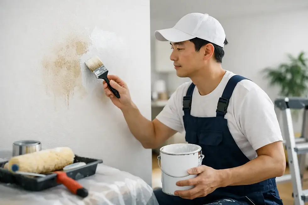
A professional interior painting process starts with protecting floors and furniture, then repairing cracks, filling imperfections, sanding surfaces smooth and applying the appropriate primers. Careful preparation helps ensure consistent colour absorption and clean edges around trims, doors, cornices and fixtures. It is the difference between paint that merely covers a wall and a finish that looks genuinely considered.
For Sydney homeowners updating a family home, preparing a property for sale or completing a renovation, the most successful 2026 palette will be one that suits the house rather than chasing a showroom look. Warm neutrals, grounded greens and selective deeper accents offer plenty of room to create that balance.
If you would like help selecting colours and achieving a clean, long-lasting interior finish, request a free quote from J&P Premier Painting & Maintenance. A considered colour plan, proper preparation and skilled application can make every room feel like it belongs in your home.


Comments